hi guys, just to be sure, i made a couple of designs at hope , but i used some photos i got from google, would those be ok ?
hmm, don't think so. you'd have to seek permission to use it, more so if your designs are selected, printed and sold. hence the point about "legal issues" arising if you don't use your own work or the stuff within this site.
sorry newb question how do i attach the file here in the comments? tnx
Quote:
Originally Posted by Cyanide
hmm, don't think so. you'd have to seek permission to use it, more so if your designs are selected, printed and sold. hence the point about "legal issues" arising if you don't use your own work or the stuff within this site.
even if theyre just the logos of the races?
Last edited by SkyBreaker; Sat, 30th-Jul-2011 at 2:57 PM.
sorry newb question how do i attach the file here in the comments? tnx
Head over to Image Shack & upload your image(s) and then use the "Insert Image" button above the reply box to insert your image via the link. Also, I merged your two posts into one, just use the edit button to add/remove things from your post rather than double-posting.
Will put some concepts together - but may not have time seeing as I am leaving for South America in two weeks. Will still submit some ideas when I get back (late October).
Head over to Image Shack & upload your image(s) and then use the "Insert Image" button above the reply box to insert your image via the link. Also, I merged your two posts into one, just use the edit button to add/remove things from your post rather than double-posting.
SkyBreaker Edit: Added the images to your post
Last edited by SkyBreaker; Sun, 31st-Jul-2011 at 2:13 AM.
Had the idea of different themed SC2 Sea horses for the different races. Here's a zerg one, keeping in mind it is almost 5am and I made this in an hour :P
Didn't find any fonts I liked, will need to draw the words manually I think.
Pretty much stole a couple of SkyBreaker's ideas (though the picture doesn't show, the seahorses are on the sleeves as well) but fixed things up in a way that I would prefer it (honestly, I like minimalism and simplicity >_>)
As expected, text/icon on the back is customisable towards the user. The blue colour on the front does not mix well with the Zerg icon on the back, unfortunately, which is why I reverted back to white. Unless someone can make it work I only feel it looks best that way.
I am no graphic designer or fashionista, but just providing feedback to guide the design process, feel free to accept or reject what I say
General feedback for current designs (and future ones):
1) I don't really like the multiple flags on any of the designs with them, it seems a bit excessive. Perhaps if you want to include a flag you could just have a 'generic flag area' and each individual can have it customized to which country he's from.
2) I don't know why everyone is using the cartoony 'sc2sea' logo that we have on our website header! I've voiced my opinion about this matter in the other thread that this cartoonish look looks pretty much like some Softnyx shirt, and I don't really want to be wearing a shirt that looks like Maple Story.
I wish someone with skillz would go do up a new logo which has a closer feel to SC2, and everyone can copy-paste THAT instead of this cartoon logo ><
As for individual preferences, I kinda like Skybreaker's font that he used for his '4gate' design. However, I'm not a fan of big prints on my T shirts, so those designs with big decals of the 3 races just look like shirts I wouldn't wear.
Big cartooney prints on a T shirt just look odd :/
Anyway, good luck with the contest guys, and keep up the good work! I DO appreciate the effort you guys are putting in!
Pretty much stole a couple of SkyBreaker's ideas (though the picture doesn't show, the seahorses are on the sleeves as well) but fixed things up in a way that I would prefer it (honestly, I like minimalism and simplicity >_>)
As expected, text/icon on the back is customisable towards the user. The blue colour on the front does not mix well with the Zerg icon on the back, unfortunately, which is why I reverted back to white. Unless someone can make it work I only feel it looks best that way.
+1 for this design. This is exactly what I was going to do but I would go even smaller.
1) Having customisable country symbol would be awesome, I don't even know what some of those countries are (now now, just because I'm Aussie doesn't mean I'm racist....just a bit sheltered 
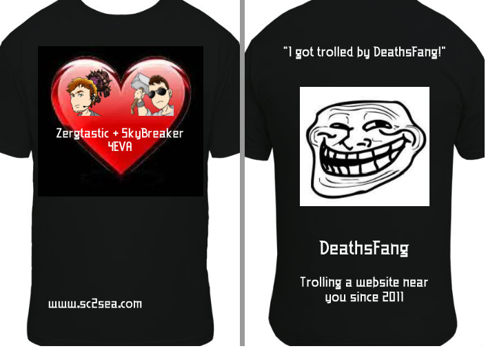
). Customisable name to match would rock, your choice to have your name or not.
2) Cartoony banner for the site is cool, but not really for a shirt about a game as bloody as SC2.
I am no graphic designer or fashionista, but just providing feedback to guide the design process, feel free to accept or reject what I say
General feedback for current designs (and future ones):
1) I don't really like the multiple flags on any of the designs with them, it seems a bit excessive. Perhaps if you want to include a flag you could just have a 'generic flag area' and each individual can have it customized to which country he's from.
2) I don't know why everyone is using the cartoony 'sc2sea' logo that we have on our website header! I've voiced my opinion about this matter in the other thread that this cartoonish look looks pretty much like some Softnyx shirt, and I don't really want to be wearing a shirt that looks like Maple Story.
I wish someone with skillz would go do up a new logo which has a closer feel to SC2, and everyone can copy-paste THAT instead of this cartoon logo ><
1) That's actually why I made them smaller and put them in a line underneath the logo. I agree if that they're too large it really does seem a bit excessive and distracting. However I do feel inclusion of all the flags are necessary for two reasons:
- It indicates what countries SEA represents, which I feel is somewhat important seeing as NA/KR/Taiwan/China are already more clearly defined.
- If we had a customised generic flag area for each individual, think about the individuals wearing the shirts :P (I'm in Australia, herpderp the shirt says I'm from Australia!) It won't really make much sense unless the majority of the community here were actively seeing each other overseas within the SEA region which I assume would be a minority :P
2) Arguably we're just using what's been provided, but I do somewhat agree with this sentiment. If someone does post up a new community-approved logo then I'll be happy to work around it. The SC2 font is easily found with a quick Google search (or at least, I'd write 'SC2SEA' using the SC2 font if I was asked to design the logo), so it's really up to Nirvana as to whether he wants to leave the logo design open ended or not.
Agree with crazerk about the flags and this sites sc2sea logo. Which is why i decided to make one myself. not very good, but it's an attempt =P.
Personally, i'd like to see a nice SC2SEA banner and a kickass seahorse made. Not too much frills with pictures and stuff. My vision is something like that of TL. You see the TL logo and you instantly recognize it as a serious force in SC2. I think that's something we can strive towards to.
Create a brand that's strong in the region (not just for Sc2, perhaps for blizzard games or expand further next time). This is a community driven site, so showing a strong sense of community would be great.
Even the smallest donations help keep sc2sea running! All donations go towards helping our site run including our monthly server hosting fees and sc2sea sponsored community tournaments we host. Find out more here.