


 SC2SEA.com - Starcraft 2 SEA eSports Community Site
> General Forums
> General
>
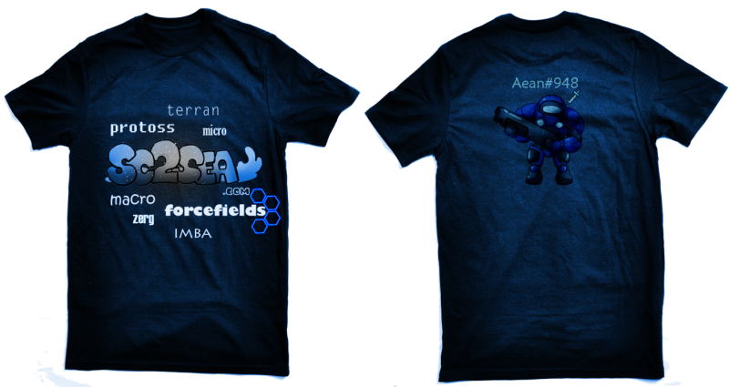
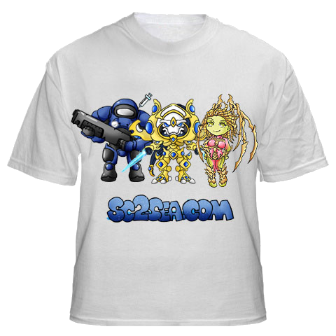
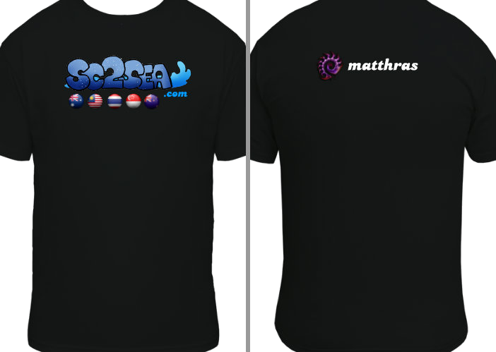
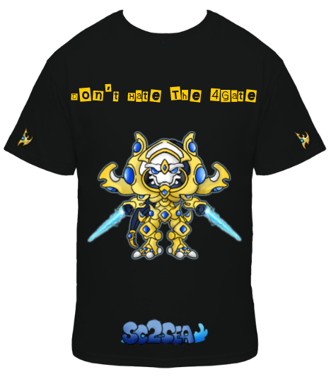
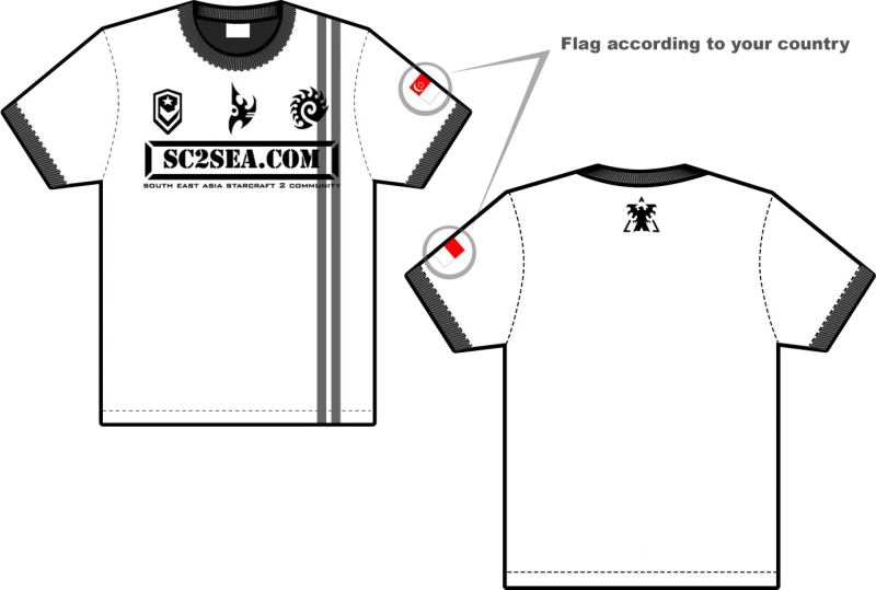
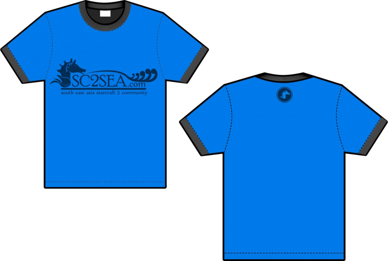
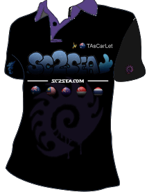
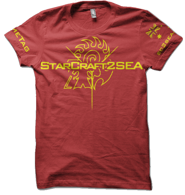
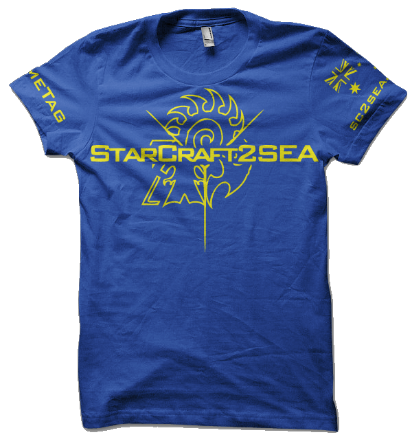
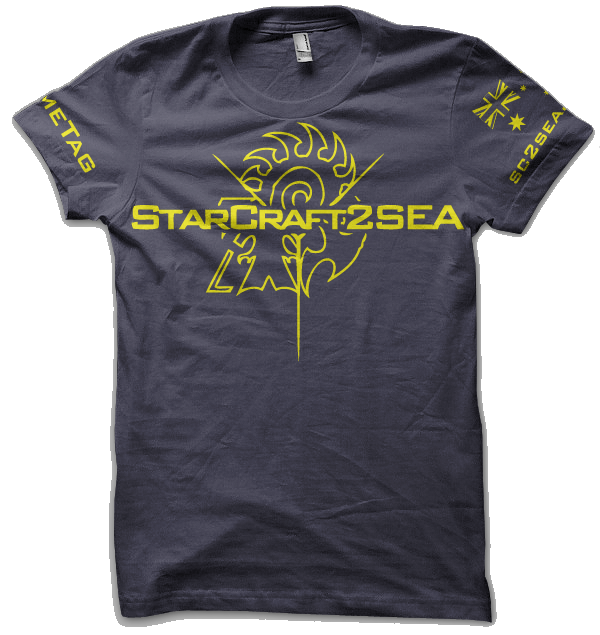
SC2SEA Official Tee Shirt Finals!!
SC2SEA.com - Starcraft 2 SEA eSports Community Site
> General Forums
> General
>
SC2SEA Official Tee Shirt Finals!!

|
«
Previous Thread
|
Next Thread
»
|
|
||||||||||||||||||||||||||||||||||||||||||||||||||||||||||||||||||||||||||||||||||||||||||||||||||||||||||||||||||||||||||||||||||||||||||||||||||||||||||||||||||||||||||||||||||||||||||||||||||||||||||||||||||||||||||||||||||||||||||||||||||||||||||||||||||||||||||||||||||||||||||||||||||||||||||||||||||||||||||||||||||||||||||||||||||||||||||||||||||||||||||||||||||||||||||||||||||||||||||||||||||||||||||||||||||||||||||||||||||||||||||||||||||||||||||||||||||||||||||||||||||||||||||||||||||


 Writer of the Year (2011)
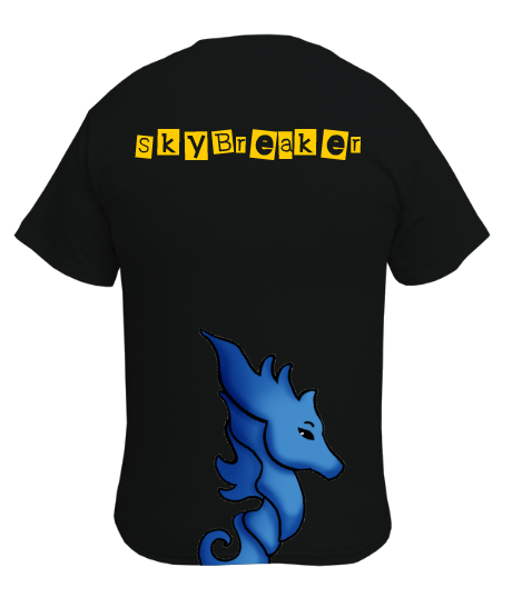
 But once again, cartooney font


 Location:


 Commentator (2011)


 ToR
ToR .
.

 Mr Steady (2011)


 Mr Banhammer (2011)


 Hybrid Mode


 2015 OSEANIC Series


 Donations
Powered by vBadvanced CMPS v3.2.2
Powered by vBulletin® Version 3.8.7
Copyright ©2000 - 2026, vBulletin Solutions, Inc.
Powered by vBulletin® Version 3.8.7
Copyright ©2000 - 2026, vBulletin Solutions, Inc.