


 SC2SEA.com - Starcraft 2 SEA eSports Community Site
> General Forums
> General
>
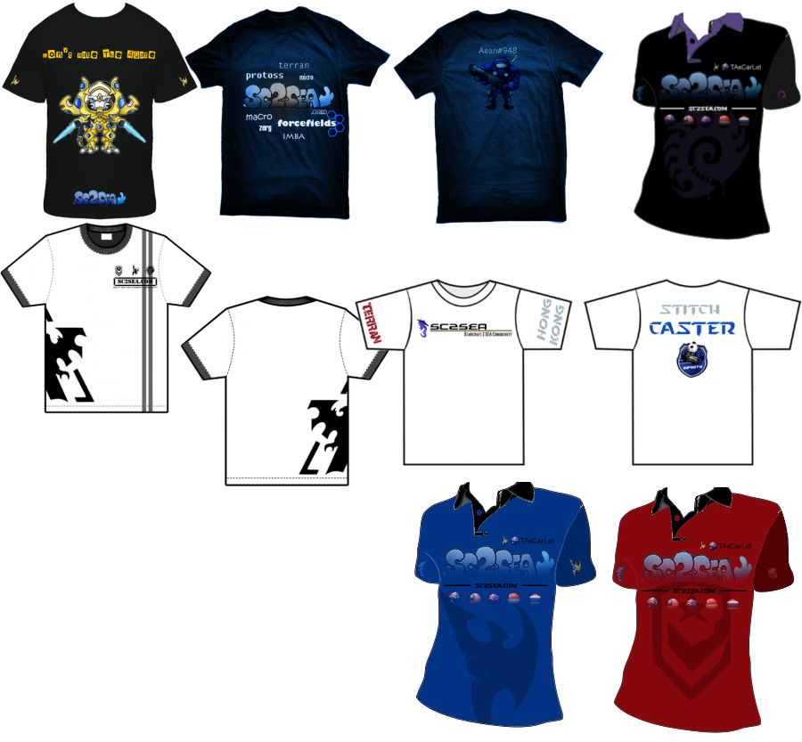
SC2SEA Official Tee Shirt Contest
SC2SEA.com - Starcraft 2 SEA eSports Community Site
> General Forums
> General
>
SC2SEA Official Tee Shirt Contest

|
«
Previous Thread
|
Next Thread
»
|
|
||||||||||||||||||||||||||||||||||||||||||||||||||||||||||||||||||||||||||||||||||||||||||||||||||||||||||||||||||||||||||||||||||||||||||||||||||||||||||||||||||||||||||||||||||||||||||||||||||||||||||||||||||||||||


 eLim | iNFENSUS eSports
 NA
NA


 Artist of the Year (2011)


 Location:


 Watch me


 Linear Mode


 2015 OSEANIC Series


 Donations
Powered by vBadvanced CMPS v3.2.2
Powered by vBulletin® Version 3.8.7
Copyright ©2000 - 2026, vBulletin Solutions, Inc.
Powered by vBulletin® Version 3.8.7
Copyright ©2000 - 2026, vBulletin Solutions, Inc.