


 SC2SEA.com - Starcraft 2 SEA eSports Community Site
> General Forums
> General
>
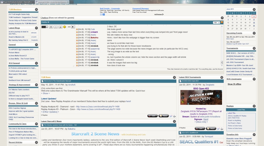
sc2sea new layout thread
SC2SEA.com - Starcraft 2 SEA eSports Community Site
> General Forums
> General
>
sc2sea new layout thread

|
«
Previous Thread
|
Next Thread
»
|
|
|||||||||||||||||||||||||||||||||||||||||||||||||||||||||||||||||||||||||||||||||||||||||||||||||||||||||||||||||||||||||||||||||||||||||||||||||||||||||||||||||||||||||||||||||||||||||||||||||||||||||||||||||||||||||


 Most Creative Writer (2011)


 Writer of the Year (2011)
 hahaha.
 Location:

 Dox_au | Dox_au
  |
| 


 , smileyfs

 Linear Mode


 2015 OSEANIC Series


 Donations
Powered by vBadvanced CMPS v3.2.2
Powered by vBulletin® Version 3.8.7
Copyright ©2000 - 2026, vBulletin Solutions, Inc.
Powered by vBulletin® Version 3.8.7
Copyright ©2000 - 2026, vBulletin Solutions, Inc.